Redesigning Fourstay's inbox to drive bookings
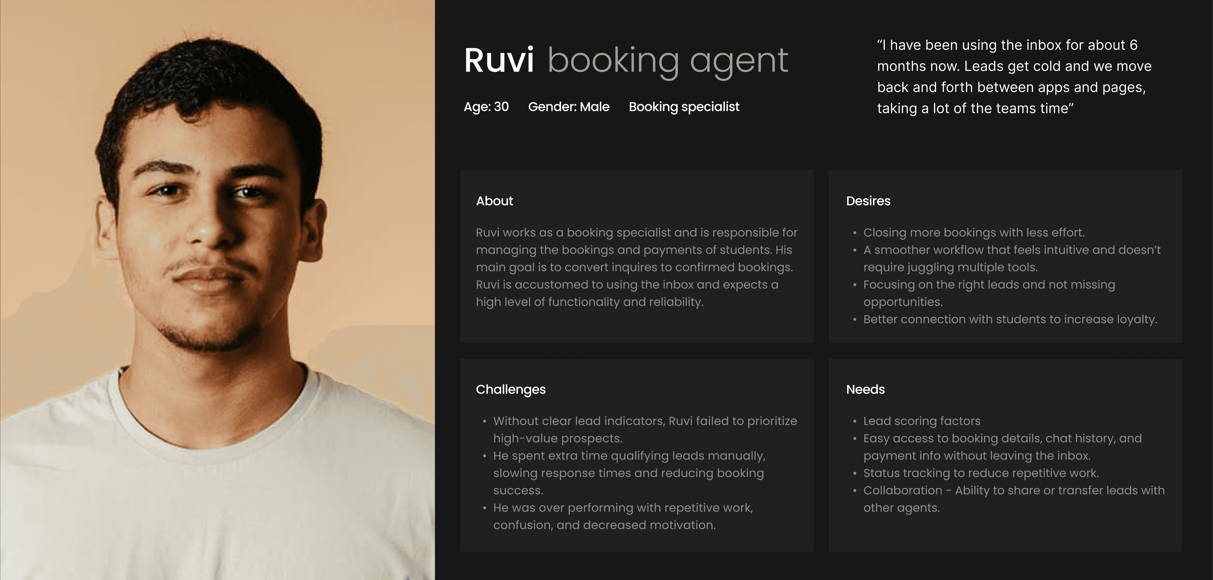
Fourstay is a student housing platform where booking agents help students in securing long term accommodation.
Problem
Initial survey revealed that Fourstay's booking agents struggled to use the inbox to generate and convert leads into confirmed bookings.
Objective
Design an inbox experience that helps booking agents to quickly identify high-quality leads and reduce manual effort - to ultimately increase conversions, sustain supply and drive better ROI.
Country
United States
Timeline
Apr '24 - Jun '24
Project summary
Business goal
Increase conversions, sustain supply and drive better ROI.
My role
As one of only two designers at Fourstay, I collaborated across product, engineering & booking teams, leading end-to-end design for four products including inbox.
User goal
Help booking agents to quickly identify high-quality leads and reduce manual effort
Strategy
Make UX improvements unblocking the team and Integrate a design system improving visual consistency and accessibility.
4X
faster lead scoring
99%
Increase in engagement
70.35 (C)
Improved usability score
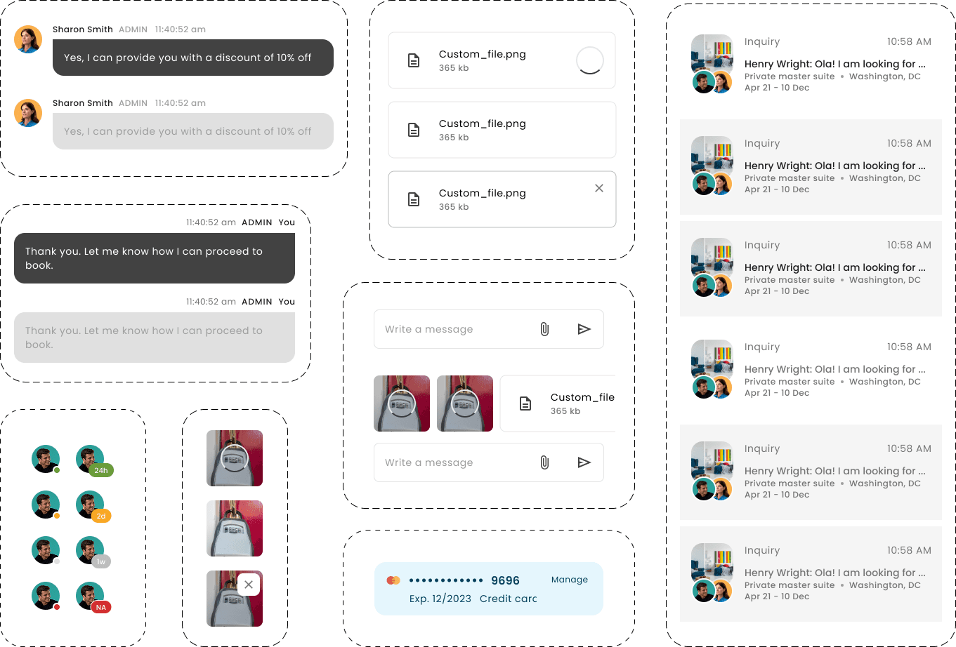
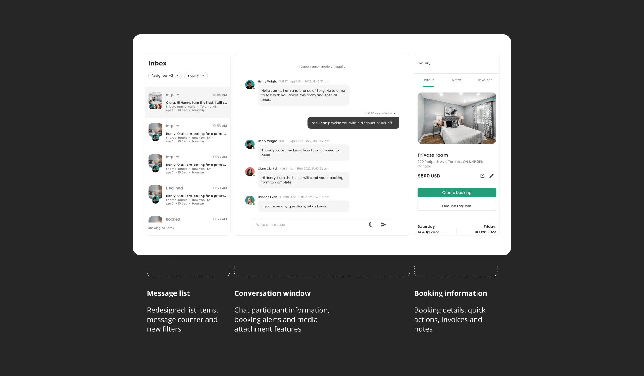
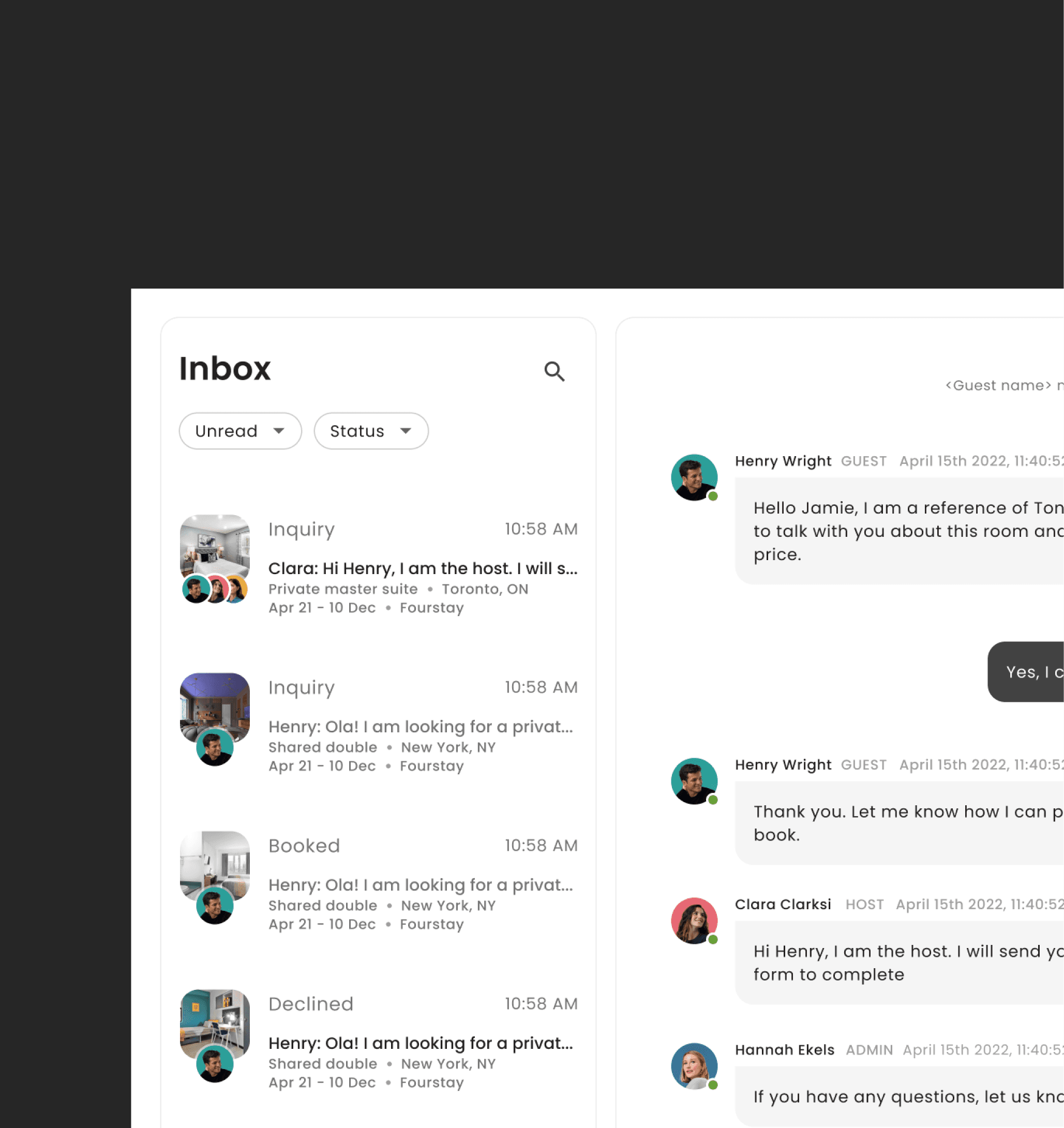
The Inbox
The inbox serves as a communication and booking hub for agents helping students secure long-term accommodation. Although live since 2019, booking agents faced major usability and adoption challenges with it.
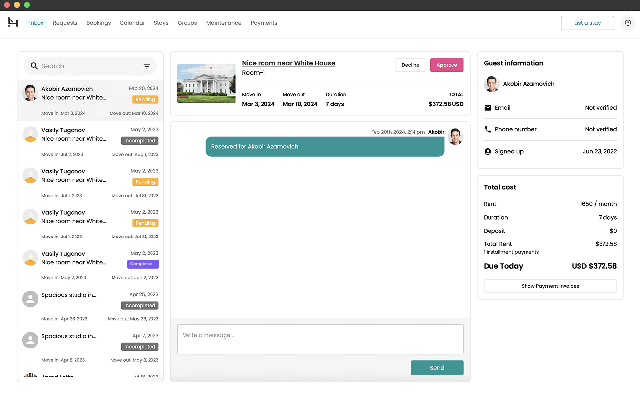
Pictured above: Inbox 1.0
Key issues
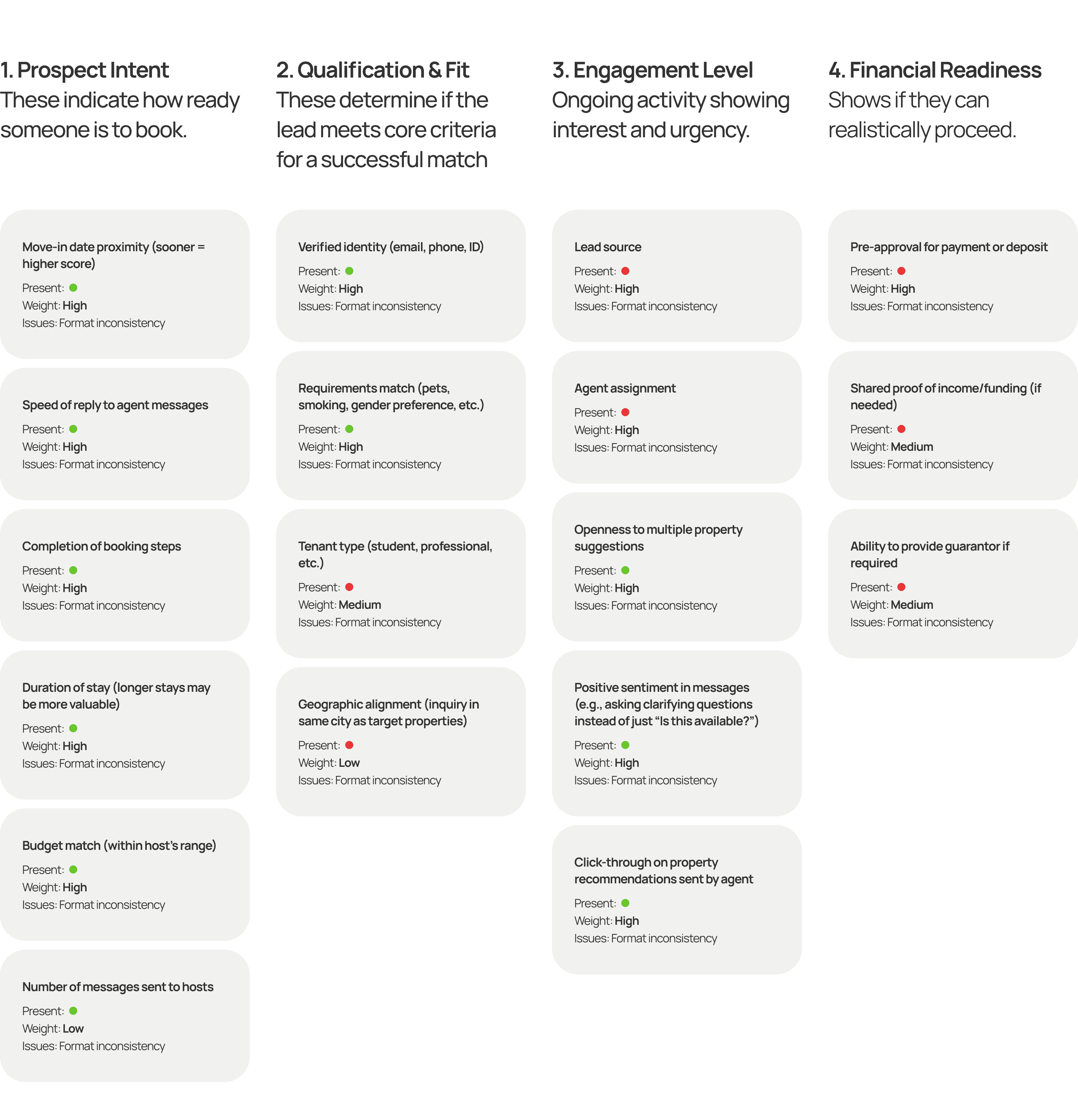
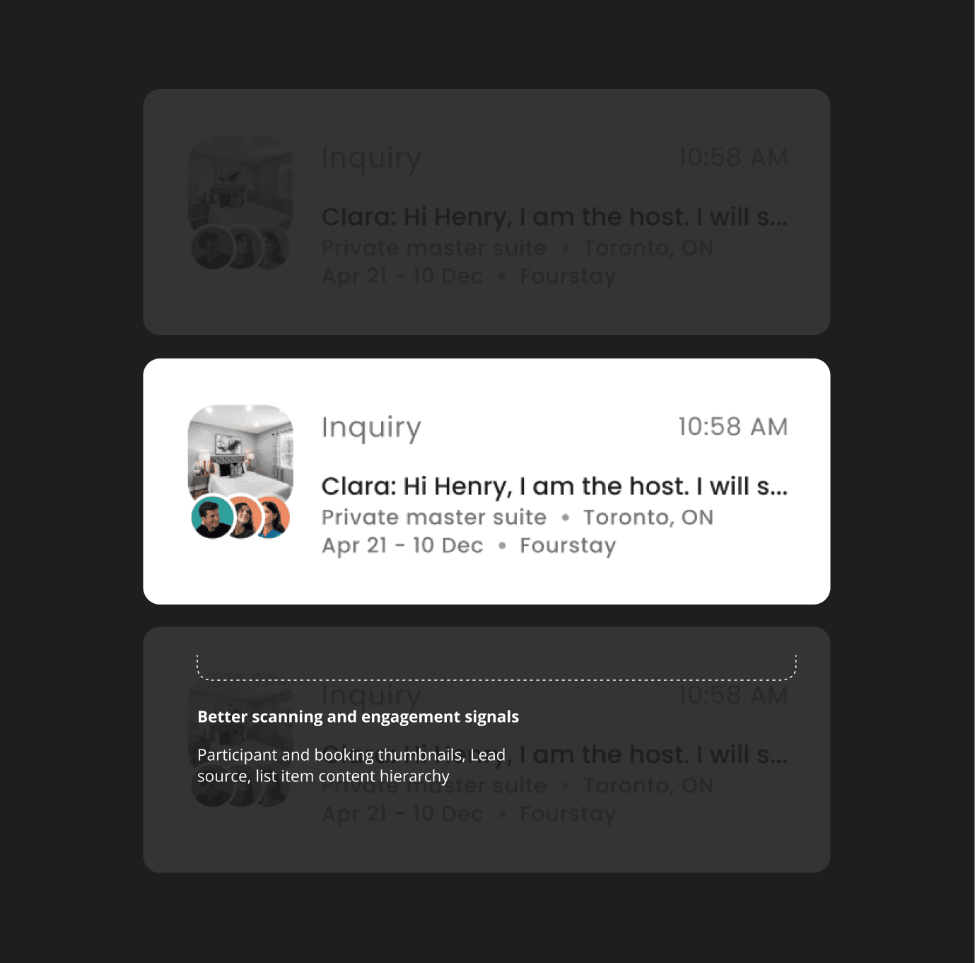
1.Lack of lead scoring factors
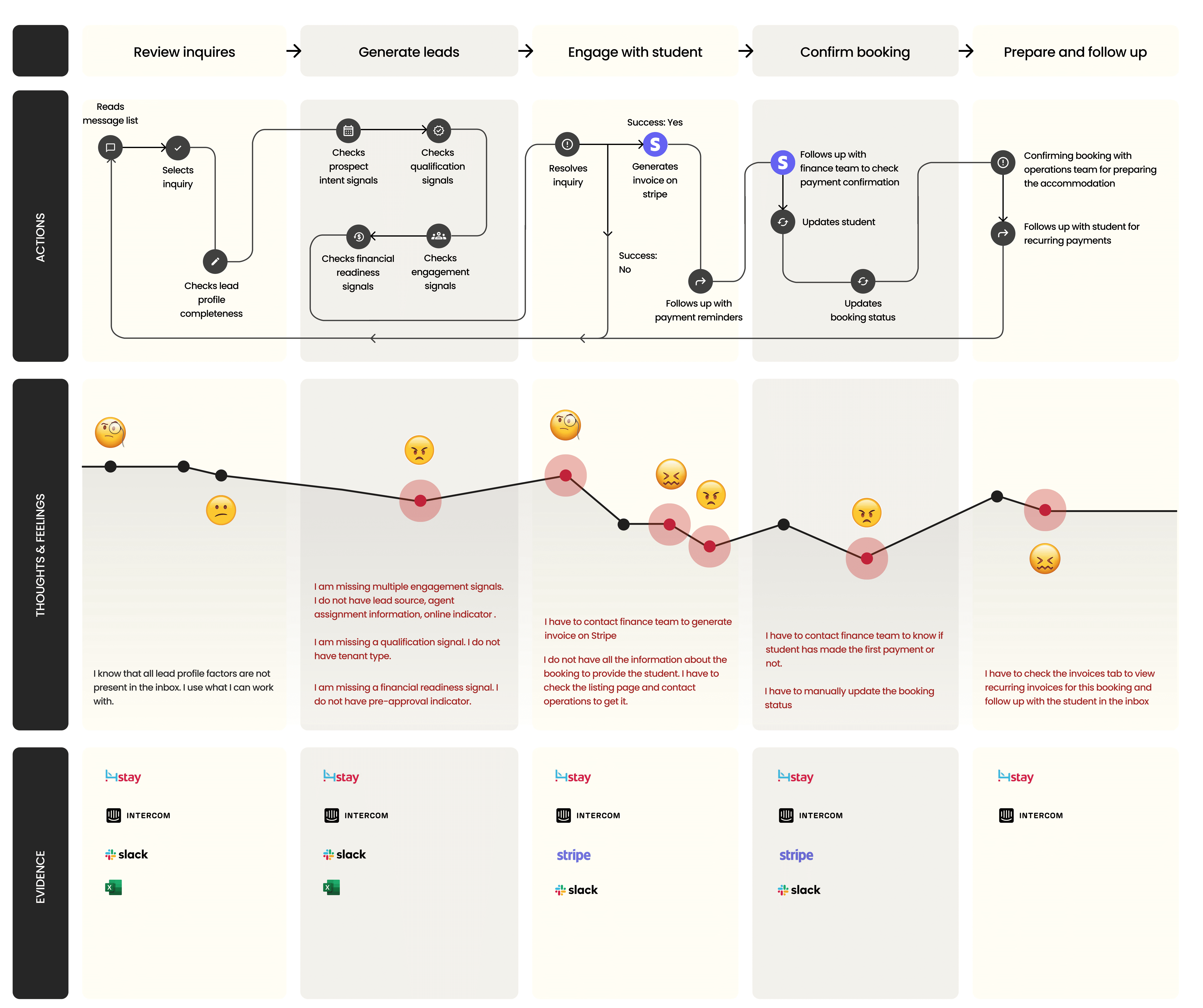
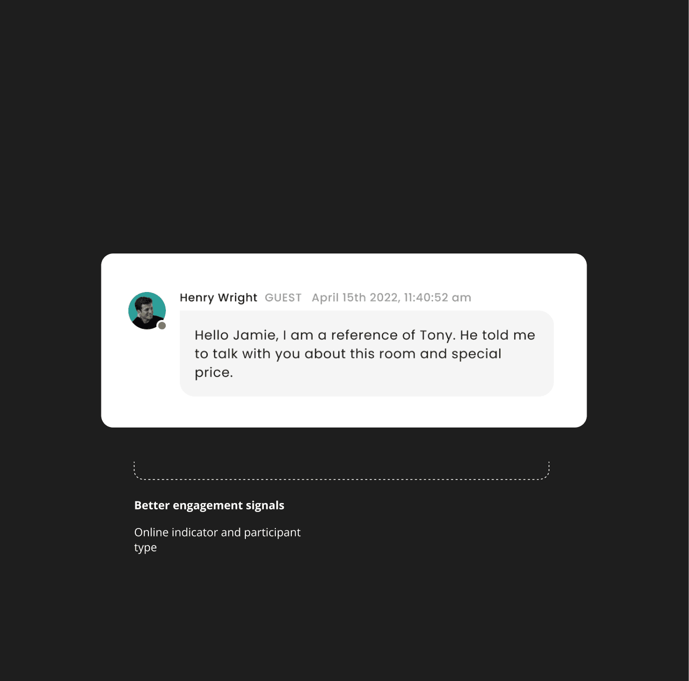
In a typical booking workflow, agents rely on a lead scoring system to prioritize serious renters over casual browsers. User interviews revealed that an incomplete system of lead scoring factors made it hard for agents to assess urgency, view engaged leads or prioritize leads effectively.
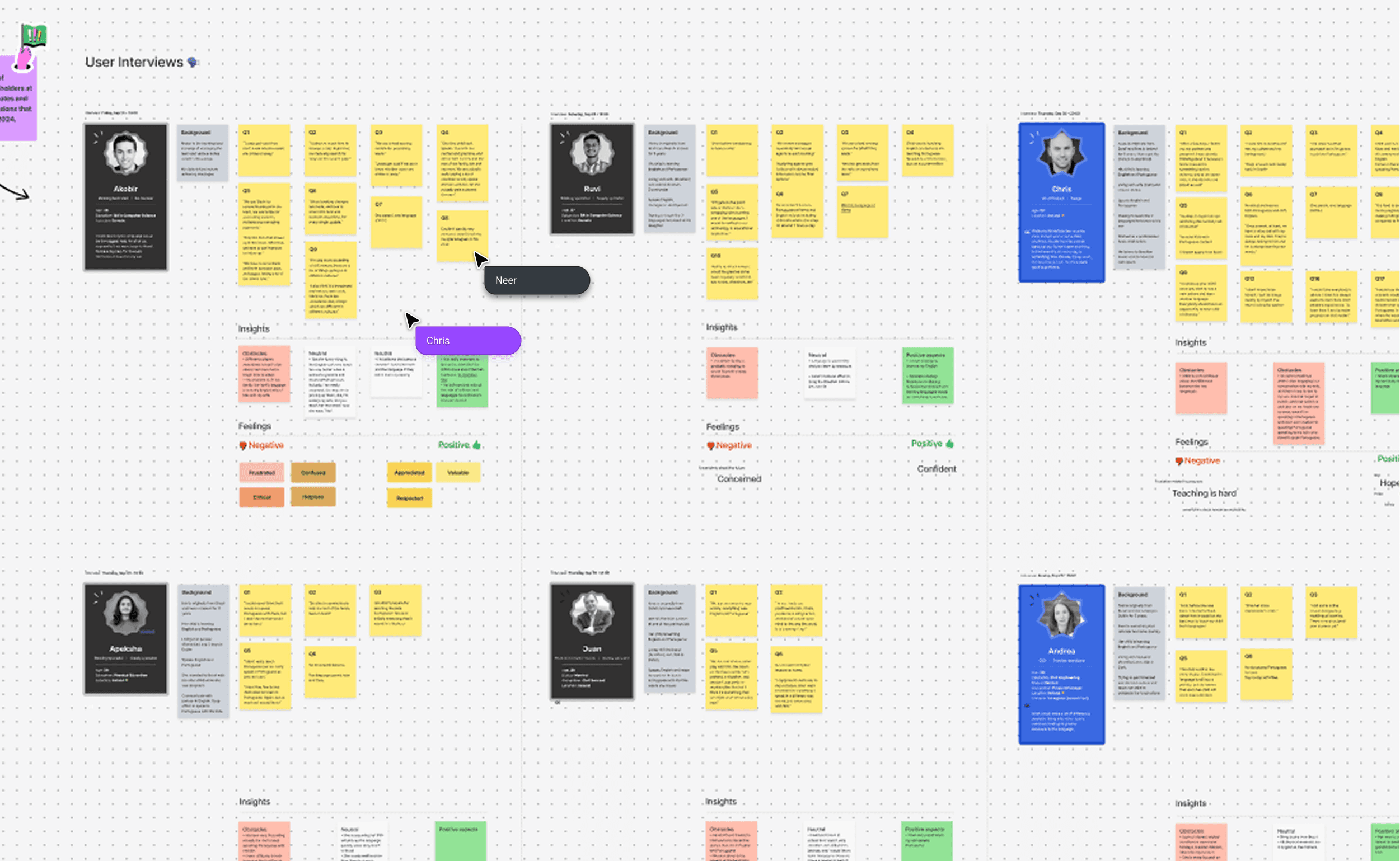
Workshop: User interviews
Key issues
2.Inefficient workflow
Agents spent an excessive amount of time to confirm payments, cancel bookings, change a stay, generate invoices and other actions. (10-20 minutes)
Key issues
3.Usability issues
I conducted heuristic analysis to uncover usability problems. I found several UX laws violated, issues with usability and accessibility.
I aggregated the evaluation reports and listed usability issues according to severity ratings from which we could prioritize.
Accessibility & semantics
Chips and buttons lack proper semantic distinction (status vs. action) and most fail to meet WCAG contrast ratio requirements.
Styling inconsistencies
Components lack visual consistency weakening UI hierarchy and brand identity- corner radii, icon styles, and color treatments.
Unresponsive layouts
Inbox layouts on tablet and mobile were unavailable. 60% of students are mobile users while 20% of hosts are tablet users.
Format issues
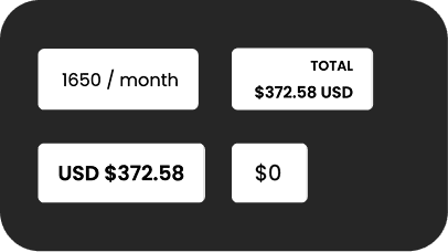
No guidelines defined for using date and currency formats.
Booking agents were struggling with conversions caused by a combination of inefficient workflows, poor lead prioritization, and lack of user engagement.
How might we redesign the inbox so booking agents can more effectively identify, prioritize, and convert student leads into confirmed bookings?
Style guide
Color & typography
I redefined the existing colour tokens to meet WCAG AA contrast standards and bring vibrancy, improving readability of text, icons, and interactive elements while maintaining visual consistency.
Primary Color 800
AA: Pass
AAA: Pass
Contrast: 5.14:1
Primary Color 600
AA: Pass
AAA: Fail
Contrast: 3.39:1
Primary Color 400
AA: Pass
AAA: Pass
Contrast: 8.55:1
Primary Color 200
AA: Pass
AAA: Pass
Contrast: 12.67:1
Primary Color 50
AA: Pass
AAA: Pass
Contrast: 18.55:1
text/primary
AA: Pass
AAA: Pass
Contrast: 16.1:1
text/secondary
AA: Pass
AAA: Fail
Contrast: 4.55:1
text/disabled
AA: Pass
AAA: Fail
Contrast: 3.49:1
Poppins
ABCDEFGHIJKLMNOPQRSTUVWXYZabcdefghijklmnopqrstuvwxyz1234567890‘?’“!”(%)[#]{@}/&\<-+÷×=>:;,.*
REGULAR
BOLD
Befor/After
Inbox redesign
The redesigned inbox supported better communications, helping booking agents engage users more effectively, leading to improved conversation rates and faster response times across the platform.
Meaningful
UX improvements
Meaningful improvements and UX fixes help to unblock the booking team and amplify their momentum to track leads and close deals.
Usability tests
and iterations
We conducted usability tests with internal teams and collected feedback from students to identify issues and make improvements
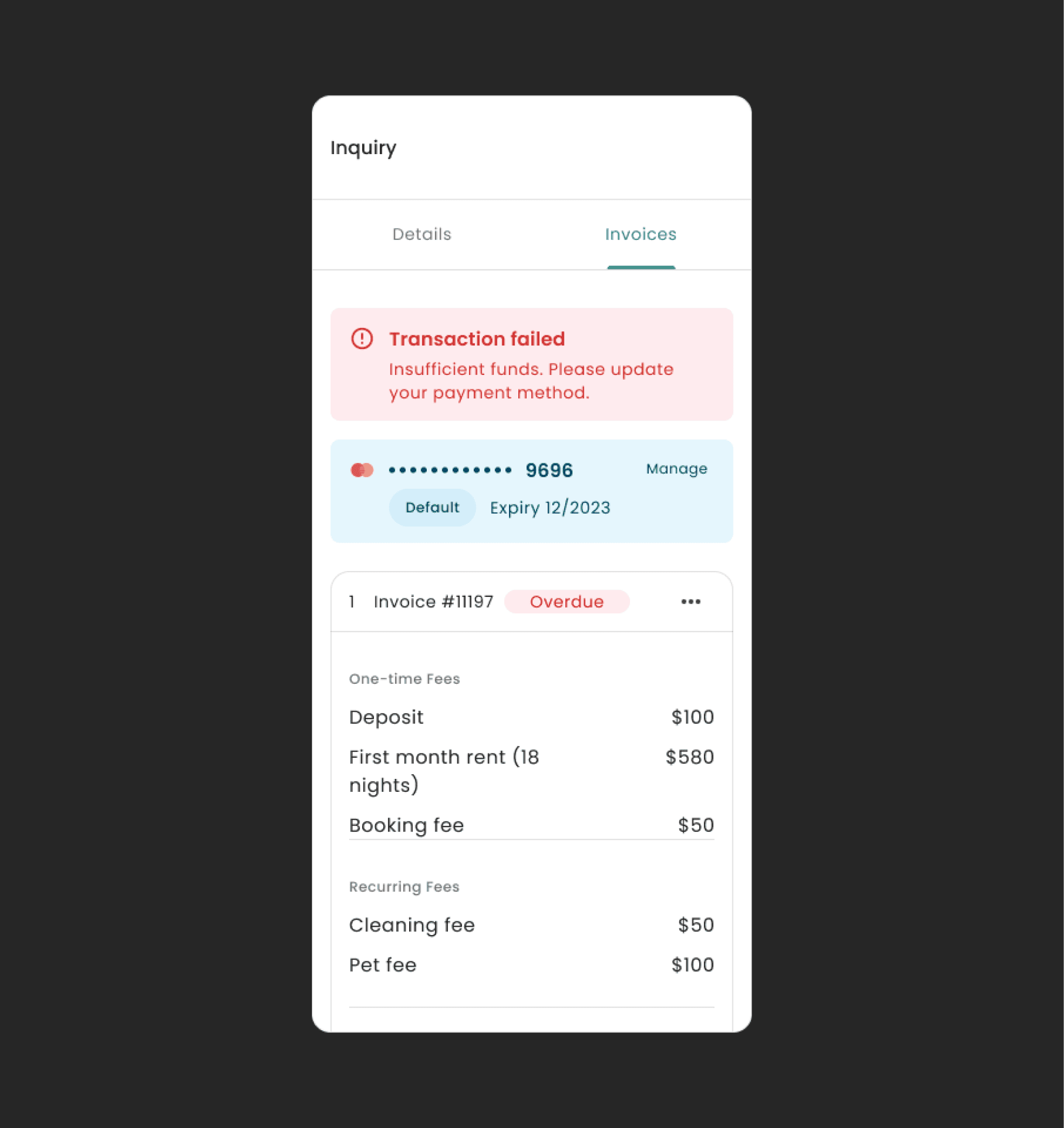
Before
Students and/or booking agents are unable to identify which invoice has a failed transaction leading to time spent searching in the transaction history of each invoice
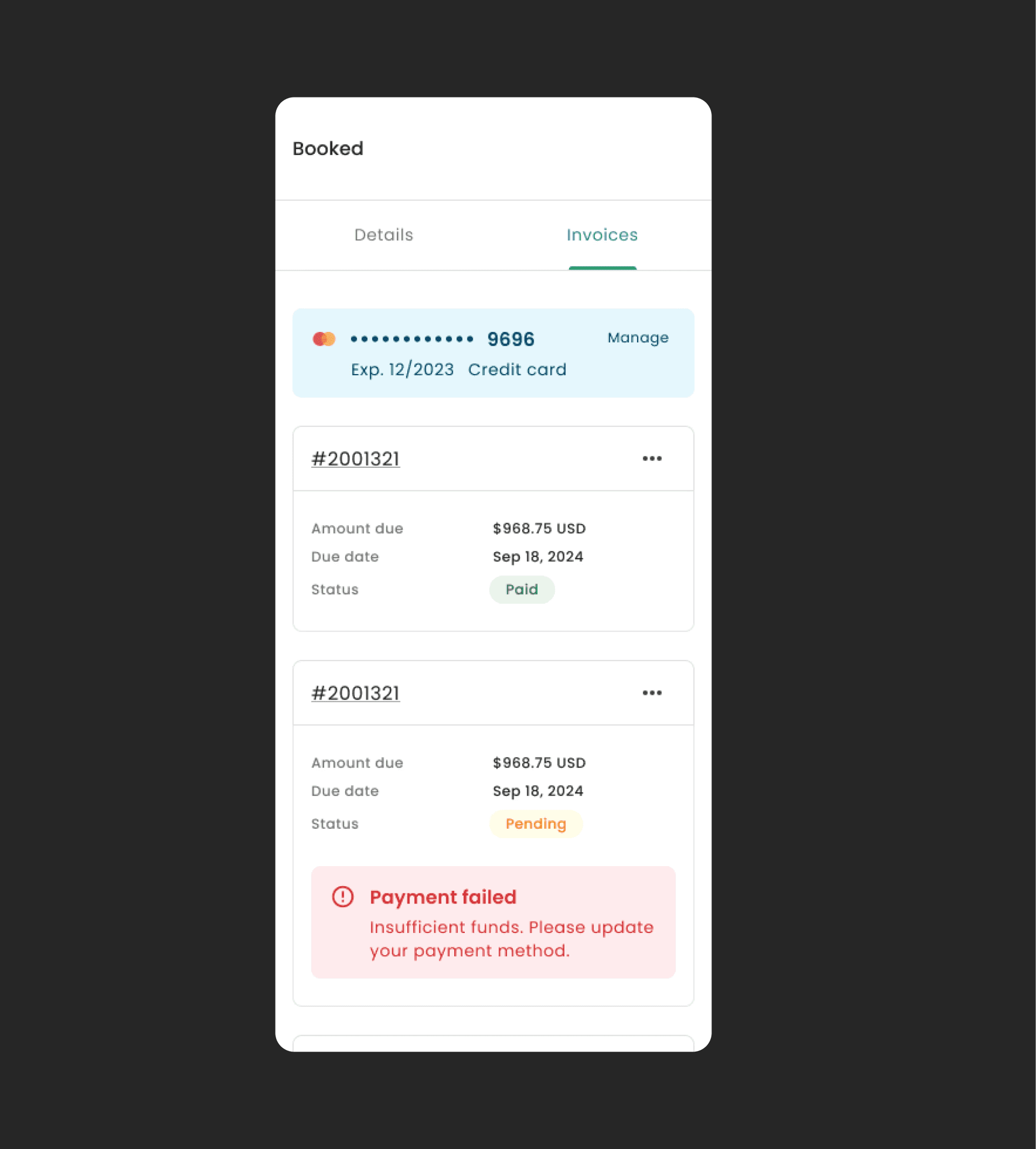
After
Alert notifications were embedded within each invoice card item to better inform the user.
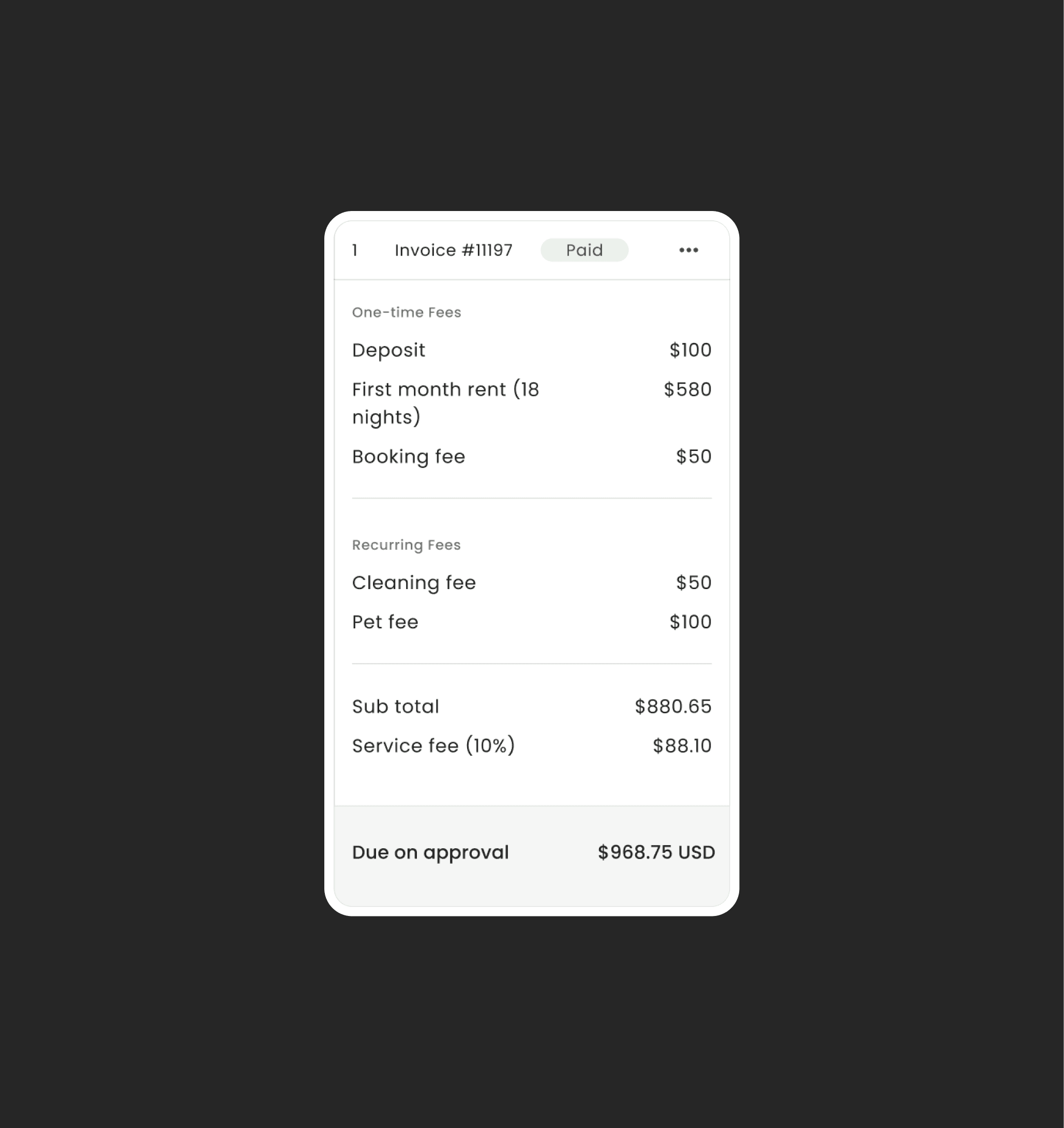
Before
For long term student housing, installments range from 6-36. Users were finding it slow to navigate and scroll to their desired invoice.
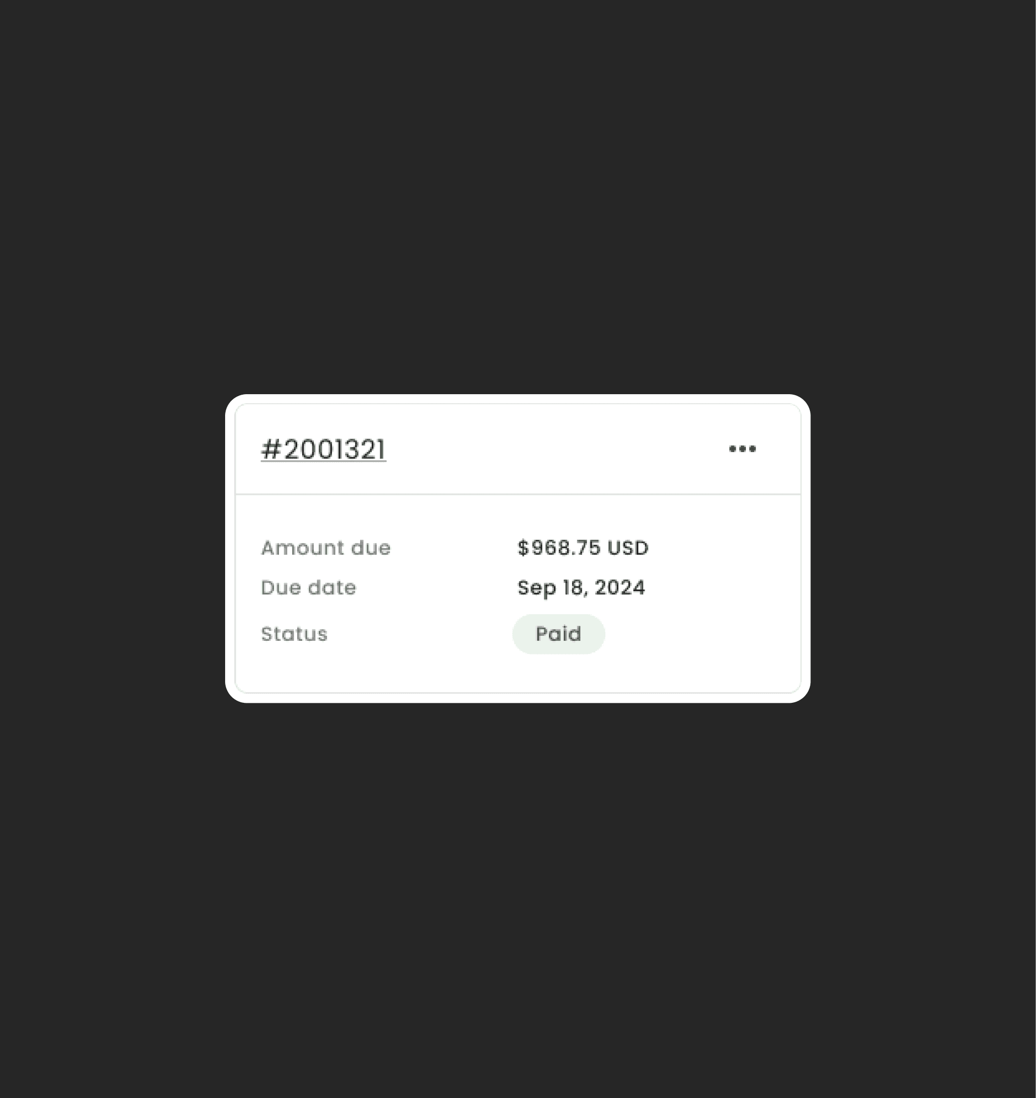
After
A full breakdown of each invoice was not needed as this list was primarily used for paying pending invoices. A shorter list would help to provide a better overview of all the installments.
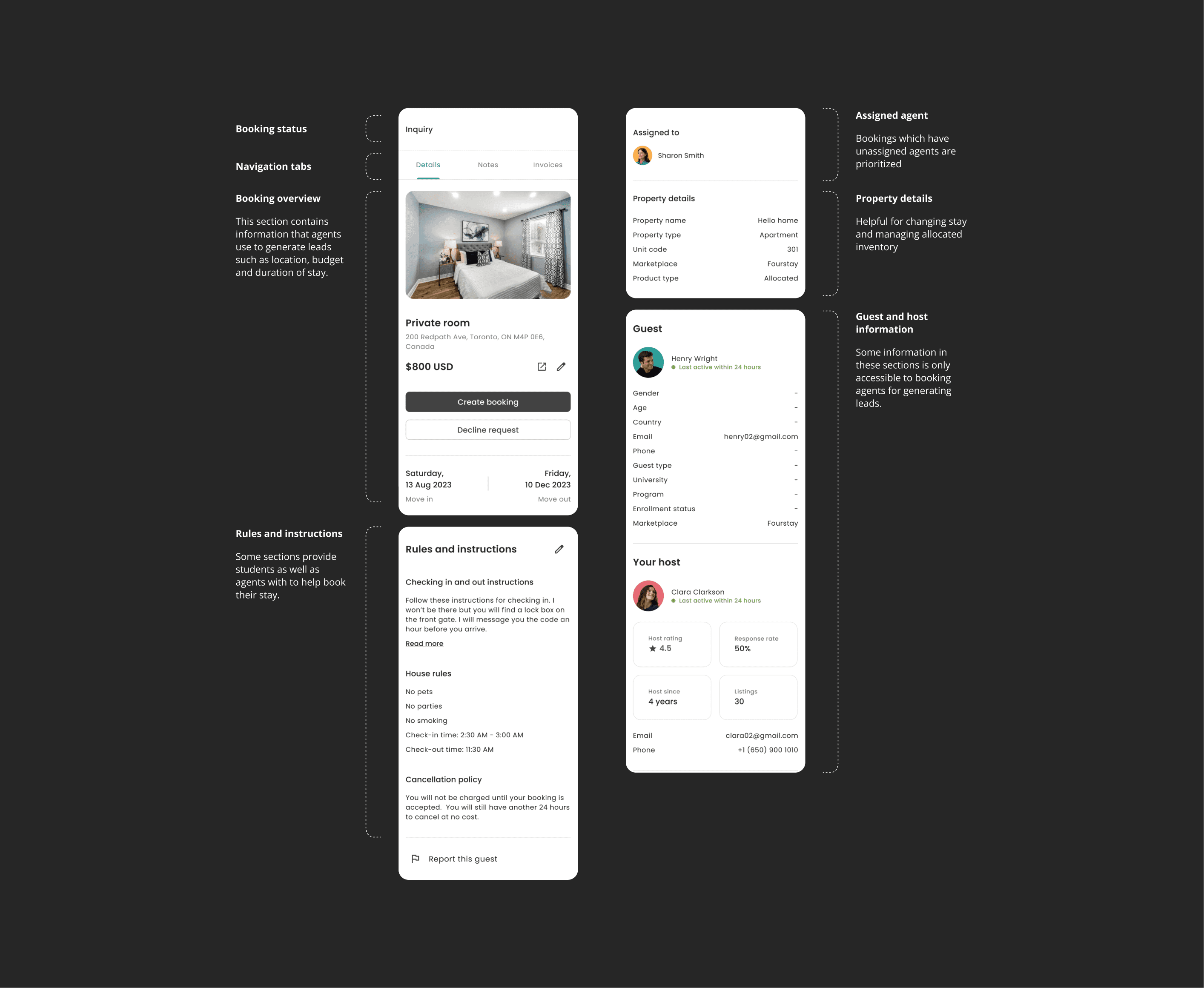
Before
A lead prioritization factor failed to work because it was not easily accessible to the booking agents.
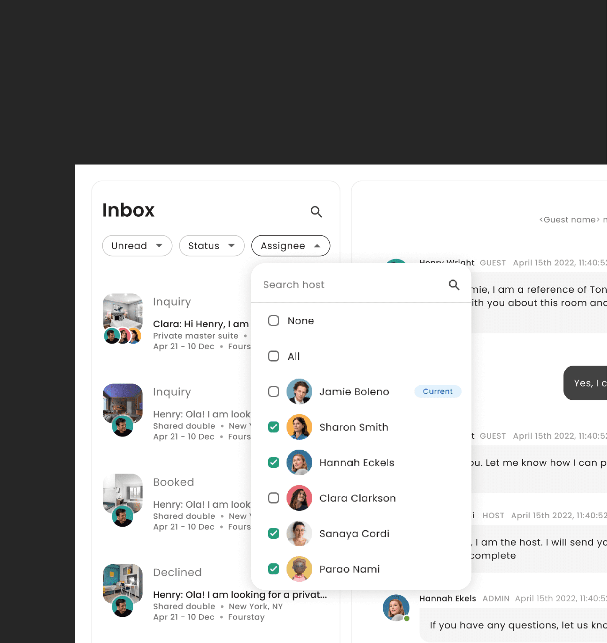
After
I added an 'Assignee' filter helping agents prioritize inquires without an agent assigned.
From frustrating bookings to meaningful conversations that lead to conversions, the inbox came to life as a bold, modern experience.
In just a few months, we launched a fully redesigned product—brand, system, and full inbox experience. The booking team felt productive and ready. They could gain leads much faster and completed bookings with much less effort.
4X
faster lead scoring
99%
Increase in engagement
70.35 (C)
Improved usability score
Key learning
Key learning: Even after 1-2 rounds of feedback, there were always more support tickets and requests for inbox features compiling as new design changes were made. It became evident that designs needed to be validated often to understand and include all desirable features into the product